
-

Improve UX of search website
The search also similar a conversation between user and system. The user shows information need like a question and system shows react like answer combination. Moreover, the search is basic active, an important element to building a website. UX is so necessary and today CMSmart will share with all customers 5 way to improve UX of search website. Let’s follow the below post.
1. Put search button place user best easy search to improve UX of search website
This is the first way in 5 way to improve UX of search website. Will not well when user difficult to find button search. Because it’s not highlighted or mixed in certain text. The below chart showed the best comfortable address for the user is the top right highest area of a page on your web. So, put a search box at the top right area on the center of a page is the most reasonable. And you will be sure your user will find it at the where they expect. Ideally, the search button should match the overall design of the website and highest when users need it.
Example: The search is one of the top most important features of eBay. Notice the contrast color for the “Search” button on the eBay home page.
Refer: Demo Magento theme, Demo WordPress theme
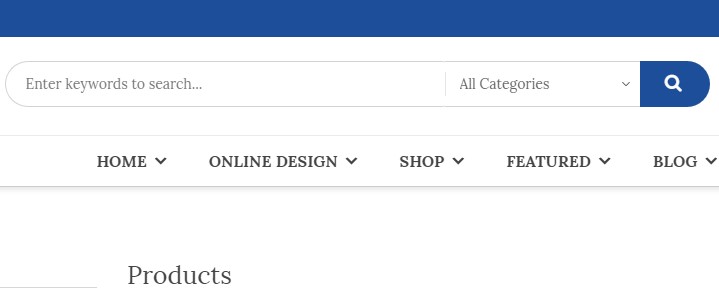
2. Using appropriate size for the enter search field. (search box)
This is the next way I want to share with you to improve UX of search website. Search field too short is a common mistake of website designer. When the user enters a long question, they just only see a part of the text. And they can’t find again, fix the question if they want. In fact, when the search box has a limited number of display characters, the user must use a short question. If the input fields are used according to their expected input size, they are easy to read and explain to the user. The general rule is that there is a 27-character text input (this size can contain 90% of queries).
3. Please specify what Users can search.
It is best to include a sample search query in the input field to suggest to the user what can be searched. HTML5 makes it easy to put text as a placeholder inside the input field. If the user can search multiple criteria, use the input suggestion form to explain (see IMDb example below). But be sure to limit your suggestion to a few words, otherwise, you’ll increase cognitive load. So, you don’t forget this issue to improve UX of search website.
4. Don’t delete user query history after click “search” button.
Save first queries of the user. The again format of the query is important to step in the information search. If the user can’t find the answer they want for the first time, they can find again search by a slightly different query. To make it easier for users to search, leave the original search term in the search box so they don’t have to re-enter the entire query.
5. Use the proposed Auto Mechanism
The Nielsen Norman Group study found that typical users rarely build questions: if they don’t get good results on their first try, subsequent search efforts are rarely successful. In fact, users often give up immediately after failing on the first try. However, this situation can be improved by using the proposed auto mechanism. The automatic suggestion mechanism helps users find an appropriate query by trying to predict it based on the characters entered. When this mechanism works well, it helps users easily search queries. Here are a few things to keep in mind when combining the auto-suggestion mechanism on your site.

Ensure that automatic proposals are helpful. Poorly designed auto suggestions can be confusing and distracting users. So use automatic spelling correction, recognition of the original words, and predictive text to improve the tool. Provide automatic suggestions as quickly as possible, such as after the third character is entered. This will provide immediate value and reduce user data entry time.
Show less than 10 suggested items (and no scrollbars) so the information is not too much for the user to overwhelm. Allows users to navigate between items using the keyboard. Highlight the difference between the entered information and the proposed information (for example, the input text is the standard size, while the suggested terms are bold).
Today’s the topic “improve UX of search website” so helpful. Thank you for watching my post. I hope you will have exciting things. If have any question, let feedback in here. I and the support team will answer for you right now.
Vincent
Sales Consultant Manager
Skype: live:vincent_4281
Phone/ WhatsApp: +84 868 901 261
Email: vincent@cmsmart.net
[toggle title=”SEE ALSO” state=”open”]
Better Customer Satisfaction Through AI-Enabled CRM Part 1
10 key for a professional e-commerce website (Part 2)
All Of PrintMart Order Upload Feature
BUILDING A HOME PAGE INTRODUCTION BEFORE STARTING THE WEBSITE (Part 1)
[/toggle]